Chapter 3. Graphical Representations in Statistics
Objectives
- Understand the purpose and benefits of graphical representation in statistics.
- Learn about the common types of graphs used in statistics.
- Explore real-world examples of graphical data visualization.
- Identify scenarios to use specific graph types.
Purpose of Graphical Representation
- Simplification: Converts large data sets into a visual format that is easier to interpret.
- Pattern Identification: Helps identify trends, outliers, and correlations.
- Decision-Making: Assists stakeholders in making informed decisions based on visual insights.
Types of Graphical Representations
1 Bar Charts
Definition:Bar charts are used to compare values across different categories. Each category is represented by a rectangular bar, and the length or height of the bar is proportional to the value it represents.
Purpose: Compare discrete categories.
Example:
import matplotlib.pyplot as plt

# Data for bar chart
categories = ['A', 'B', 'C', 'D']
values = [10, 24, 36, 40]

plt.figure(figsize=(8, 5))
plt.bar(categories, values, color='skyblue')
plt.title('Bar Chart Example')
plt.xlabel('Categories')
plt.ylabel('Values')
plt.show()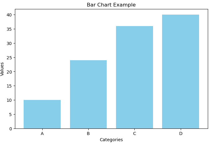
2 Line Charts
Definition: Line charts display information as a series of data points connected by straight lines. They are useful for showing trends over time or continuous data.Example:
import matplotlib.pyplot as plt

# Data for line chart
x = [0, 1, 2, 3, 4, 5]
y = [0, 1, 4, 9, 16, 25]

plt.figure(figsize=(8, 5))
plt.plot(x, y, marker='o', linestyle='-', color='b')
plt.title('Line Chart Example')
plt.xlabel('X Axis')
plt.ylabel('Y Axis')
plt.show()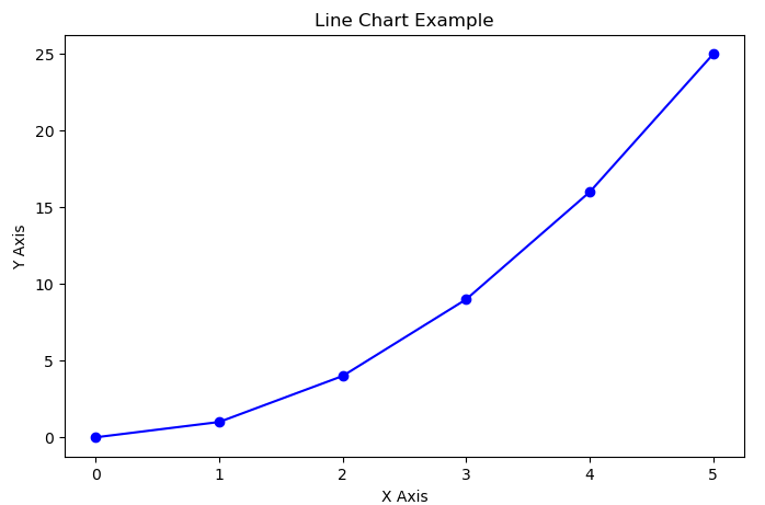
3 Pie Charts
Definition: Pie charts represent data in a circular graph divided into slices, where each slice's size is proportional to its percentage of the whole. They work best for showing parts of a whole.
Example:
import matplotlib.pyplot as plt
# Data for pie chart
labels = ['Apple', 'Banana', 'Cherry', 'Date']
sizes = [30, 20, 25, 25]
colors = ['gold', 'yellowgreen', 'lightcoral', 'lightskyblue']
explode = (0.1, 0, 0, 0)  # "explode" the first slice

plt.figure(figsize=(8, 5))
plt.pie(sizes, explode=explode, labels=labels, colors=colors,
autopct='%1.1f%%', shadow=True, startangle=140)
plt.axis('equal')  # Ensures the pie is drawn as a circle.
plt.title('Pie Chart Example')
plt.show()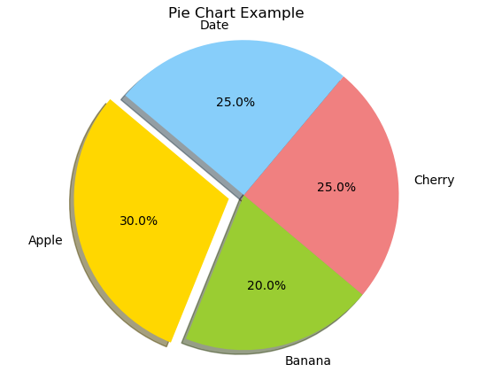
4 Scatter Plots
Definition:Scatter plots display values for two variables as points on the Cartesian plane. They are ideal for visualizing the relationship or correlation between two datasets.
Purpose: Visualize relationships between two continuous variables.
Example:
import matplotlib.pyplot as plt
import numpy as np

# Random data for scatter plot
np.random.seed(0)
x = np.random.rand(50)
y = np.random.rand(50)

plt.figure(figsize=(8, 5))
plt.scatter(x, y, color='red', marker='o')
plt.title('Scatter Plot Example')
plt.xlabel('X Axis')
plt.ylabel('Y Axis')
plt.show()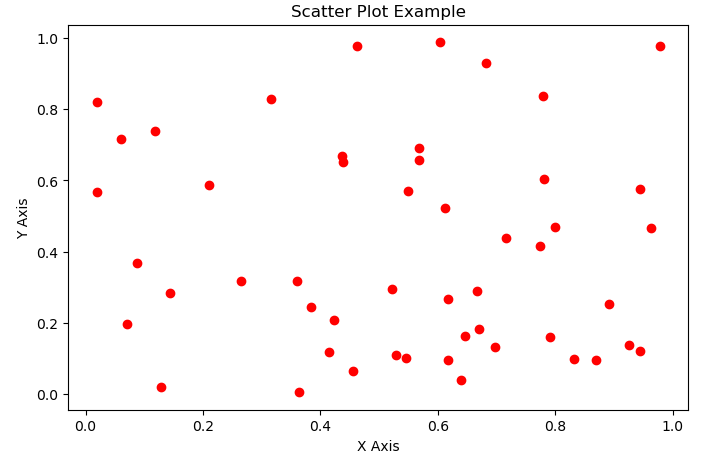
5 Histograms
Definition:Histograms are used to represent the distribution of numerical data by showing the number of data points that fall within specified ranges (bins). They are useful for understanding the underlying frequency distribution of a dataset.
Purpose: Show the distribution of data.
Example:
import matplotlib.pyplot as plt
import numpy as np

# Generate random data for histogram
data = np.random.randn(1000)

plt.figure(figsize=(8, 5))
plt.hist(data, bins=30, color='purple', edgecolor='black')
plt.title('Histogram Example')
plt.xlabel('Data')
plt.ylabel('Frequency')
plt.show()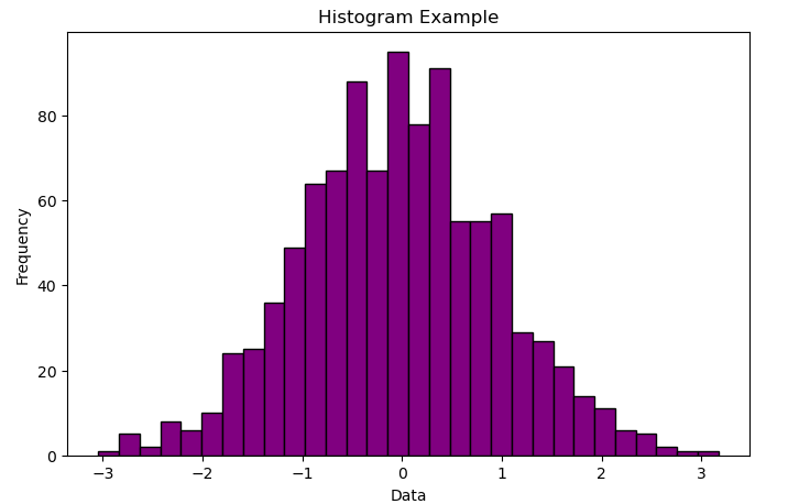
6 Box Plots
Definition:Box plots (or box-and-whisker plots) summarize a dataset by displaying its median, quartiles, and potential outliers. They provide a visual summary of the data’s distribution and variability.
Purpose: Identify the spread and outliers in data.
Example:
- Comparing test scores across multiple classes.
import matplotlib.pyplot as plt
import numpy as np

# Generate sample data for box plot
data = [np.random.normal(0, std, 100) for std in range(1, 4)]

plt.figure(figsize=(8, 5))
plt.boxplot(data, vert=True, patch_artist=True,
            labels=['Std=1', 'Std=2', 'Std=3'])
plt.title('Box Plot Example')
plt.xlabel('Dataset')
plt.ylabel('Values')
plt.show()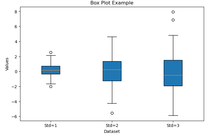
7 Stem Plot
Definition:A stem plot is a graphical tool that displays data points as stems rising from a baseline, which can help in identifying the distribution of a dataset. Although a traditional stem-and-leaf plot is textual, matplotlib’s stem function provides a similar visual representation.
Example:
import matplotlib.pyplot as plt
import numpy as np

# Data for stem plot
x = np.arange(0.1, 2, 0.1)
y = np.exp(x)

plt.figure(figsize=(8, 5))
plt.stem(x, y, linefmt='grey', markerfmt='D', basefmt=" ")
plt.title('Stem Plot Example')
plt.xlabel('X Axis')
plt.ylabel('Y Axis')
plt.show()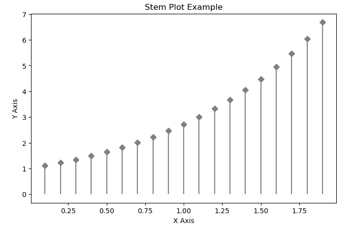
8 Heatmaps
Definition:Heatmaps are a type of visualization that represent matrix-like data where individual values are displayed as colors. This type of plot is particularly useful for identifying patterns, correlations, or variations across two dimensions. For example, heatmaps are widely used in fields like biology for gene expression data, in finance for correlation matrices, or in geospatial analysis.
Example:
import numpy as np
import matplotlib.pyplot as plt

# Generate a 10x10 matrix of random data
data = np.random.rand(10, 10)

plt.figure(figsize=(8, 6))
# Display the data as an image with a color map
plt.imshow(data, cmap='viridis', interpolation='nearest')
plt.colorbar()  # Add a colorbar to show the scale
plt.title('Heatmap Example')
plt.xlabel('X Axis')
plt.ylabel('Y Axis')
plt.show()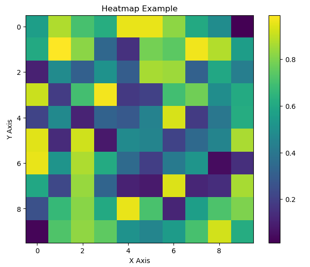
9 Stem and Leaf
Definition:A stem-and-leaf plot is considered a type of plot or data display, but it differs from many common graphical plots. A stem‐and‐leaf plot is a method of displaying quantitative data in a graphical format similar to a histogram, while retaining the original data values. Unlike graphical stem plots (which use vertical lines and markers), a traditional stem‐and‐leaf plot is text-based. It splits each number into two parts: the "stem" (typically all but the final digit) and the "leaf" (the last digit). This method is especially useful for small datasets, allowing you to quickly see the shape of the distribution.
Example:
    def stem_and_leaf(data):
    # Sort the data to maintain order
    data = sorted(data)
    stems = {}

    # Split each number into stem and leaf parts.
    # Here, the stem is the tens digit and the leaf is the ones digit.
    for number in data:
    stem, leaf = divmod(number, 10)
    if stem not in stems:
    stems[stem] = []
    stems[stem].append(leaf)

    # Print the stem and leaf plot header
    print("Stem | Leaf")
    print("-----+----------------")
    # Iterate through stems in sorted order and print the leaves
    for stem in sorted(stems.keys()):
    # Sort leaves for a cleaner display
    leaves = " ".join(str(leaf) for leaf in sorted(stems[stem]))
    print(f"  {stem}  | {leaves}")

    # Example data set
    data = [12, 15, 22, 27, 31, 34, 37, 41, 45, 48]
    stem_and_leaf(data)


    Output:
    Stem | Leaf
    -----+----------------
    1  | 2 5
    2  | 2 7
    3  | 1 4 7
    4  | 1 5 8